Google searches of the term "renewable energy" peaked in March of 2009. Since then, Google searches for renewable energy having been trending downwards. In comparison, searches of the term "fracking" really started to take off in late 2010 and hit a record high in February of this year.
Here is a regional map of searches for renewable energy. Searchers in Europe, Africa, India, and Australia have shown strong interest in renewable energy.
Here is a regional map of searches for fracking. Notice how much search interest there is in this term coming from the US and South Africa.
Friday, 19 April 2013
Wednesday, 17 April 2013
Maximum Drawdown for Previous Post
In my previous post I compared several investment strategies for the TSE. Here is an updated table which includes drawdown along with some of the usual risk measures. The seasonal strategy has the highest average annual return (11.35%) and lowest standard deviation. The seasonal strategy has the highest Sharpe Ratio, Sortino Ratio, and Omega Ratio.The seasonal strategy also has the lowest maximum drawdown.

Here is a chart showing how $1000 invested in December of 1970 has performed for each of the strategies.

Overall, the seasonal and moving average strategies provide some downside protection in case things go really bad.

Here is a chart showing how $1000 invested in December of 1970 has performed for each of the strategies.

Overall, the seasonal and moving average strategies provide some downside protection in case things go really bad.
Wednesday, 10 April 2013
Testing Absolute Momentum on the TSE
A new research paper by Gary Antonacci on absolute momentum piqued my interest.In its simplest form, absolute momentum strategies compare excess asset returns over a pre-defined look back period. If excess returns over the look back period are positive, invest in the asset. If excess returns over the look back period are negative, invest in a 3 month t bill.Antonacci's research shows that absolute momentum strategies work well in a number of markets including US equities, US REITS, US bonds, EAFE, and gold. I thought it would be interesting to see how well an absolute momentum strategy works for the TSE.
For equity data I use the MSCI Canada total return monthly data (includes dividends). For the risk free rate, I use 3 month Canadian t bills. I choose a look back period of 12 months. 12 months seems to work well for other assets so I choose 12 months for my analysis. This minimizes data snooping. The estimation sample covers the period January 1971 to March 2013. For comparison purposes, I also include buy and hold (B&H), a simple MA(10) switching portfolio, and a seasonal switch strategy (invest in the TSE in the 6 months November through April: invest in 3 month t bills for the 6 months May through October). The calculations do not include trading costs.

In the case of Canada, there is some evidence that absolute momentum works. Absolute momentum is preferred to buy and hold because it has a higher Sharpe ratio, Sortino ratio, and Omega ratio. One undesirable feature, however, is that absolute momentum has higher downside risk than buy and hold. Notice how the seasonal switch strategy really stands out. The seasonal switch strategy has the highest Sharpe ratio, Sortino ratio, and Omega ratio. The seasonal switch strategy also has the lowest standard deviatiion and downside risk.
Friday, 22 March 2013
Risk Measures for TSX Investing Strategies
Here are some risk measures for my previous post. Notice that the seasonal switch strategy generates the highest average annual returns, lowest average annual standard deviation, highest Sharpe ratio, and lowest downside risk. I calculate downside risk using semi-standard deviations with a benchmark of 0.


Wednesday, 20 March 2013
Seasonality and Trend Following on The TSX
Here is a chart showing how three simple investment strategies on the
TSX compare. The returns are calculated from price returns (no
dividends) over the period 1957 to 2012. The MA(10) switch portfolio
uses a moving average trend following strategy by comparing monthly
closing prices with a moving average of length ten. Buy or hold the TSX
when the monthly close of the TSX is above the 10 month moving average
and sell the TSX if it falls below the 10 month moving average. The
seasonal switch portfolio invests in the TSX during the 6 month period
November to April and then at the end of April the portfolio is sold and
the money held in 3 month Treasury bills. The buy and hold strategy
produces the lowest returns and highest standard deviation.The seasonal
switch produces the highest returns and lowest standard deviation.
Using these average annual returns it is useful to do some future value calculations. Suppose that at the beginning of each year, an individual invested $13,500. This is done each year for 25 years. At the end of a 25 year period, the buy and hold strategy generates $730,747 while the seasonal switch portfolio generates $1,337,942. Commissions and trading fees are not included in the calculations.

The average monthly returns on the TSX vary considerably. September and October are, on average the worst months while December and January are the best months.

Thursday, 21 February 2013
Renewable Energy in the US
Below is a link to a good video showing how the US is moving forward with renewable energy. Here are some of the highlights.
A combination of federal and state rebates and tax incentives are providing strong incentives to adopt renewable energy. In Washington State, for example, home owners who install solar panels can expect a payback period of between 5 and 7 years.
Jobs in the US solar industry increased 13% last year, compared to just 2% for the overall economy.
In Texas, 1/4 of all electricity produced comes from wind farms.
The US outspends Canada 18 to 1 on per capita spending on clean tech.
The video also features Itek, a US solar manufacturer run by a Canadian.
Friday, 8 February 2013
Renewable Energy Moving Forward
The Pew Charitable Trusts recently published a research report on the state of renewable energy. They are predicting that global revenue from the installation of renewable energy
technologies would grow at a
compound annual rate of eight per cent from $200bn in 2012 to $327bn by
2018. This would create cumulative revenue of $1.9tr. The compound annual rate of 8% is consistent with other projections (eg. IEA). In general, most analysis shows that renewable energy usage is the fastest growing component of the energy mix.
The Pew report points out that while there are tremendous opportunities for countries to profit from this trend in renewable energy investment, countries without a well formulated energy policy are likely to lose out. The report highlights the case in the US but this equally applies to Canada. There are 118 countries with renewable energy targets. Unfortunately, neither Canada or the US is among them.
Here are a few interesting figures from the Pew report showing that G20 countries are leading the way in clean energy investment and how the cost of solar energy modules has fallen dramatically.


In order to get an idea of how renewable energy depends upon income and CO2 emissions, I gathered some data on world energy consumption, CO2 emissions, GDP, and renewable energy production from the World Bank on line database.Renewable energy includes biomass, wood waste, geothermal, solar, wind, tide, wave, etc. but excludes hydroelectric power.
The units for my variables are:
energy is measured in millions of kt of oil equivalent
renewable energy is measured as electricity production from renewable sources, excluding hydroelectric (billions of kWh)
CO2 is measured in millions of kt of carbon dioxide emissions
GDP is measured in trillions of 2005 international dollars
Looking at year over year % changes indicates that energy use, GDP, and CO2 emissions track each other very closely. Notice that renewable energy tends to have much greater fluctuations.

Here is how renewable energy correlates with CO2 emissions. Both variables are measured in natural logarithms.
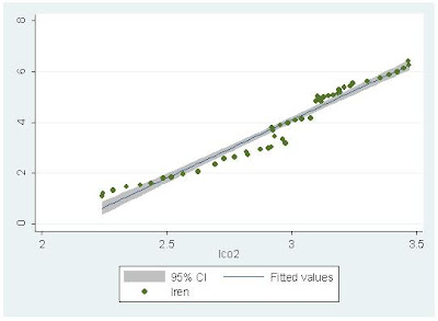
Along the best fit line, a 1% increase in CO2 emissions is associated with a 4.59% increase in renewable energy.
Here is how renewable energy correlates with GDP. Both variables are measured in natural logarithms.

Along the best fit line, a 1% increase in GDP is associated with a 2.99% increase in renewable energy. The high income elasticity is consistent with some of my previous research on renewable energy consumption in developed and emerging economies (here, here).
By comparison, a 1% increase in GDP is associated with a 0.58% increase in total energy consumption.

As the world economy rebounds from the Great Recession, economic activity will increase and GDP will increase. Increases in GDP have a bigger impact on renewable energy consumption than total energy consumption, so expect to see further increases in renewable energy in the future. Unfortunately, without a reasonable energy policy, Canada and the US will be left on the sidelines as other countries capture competitive advantage in the renewable energy sector.
Subscribe to:
Posts (Atom)