For those working in quantitative finance, this has been expected for a while. Now, there is some good solid research backing up this claim. The full paper is available here.
"Several
hundred individuals who hold a Ph.D. in economics, finance, or others
fields work for institutional money management companies. The gross
performance of domestic equity investment products managed by
individuals with a Ph.D. (Ph.D. products) is superior to the performance
of non-Ph.D. products matched by objective, size, and past performance
for one-year returns, Sharpe Ratios, alphas, information ratios, and the
manipulation-proof measure MPPM. Fees for Ph.D. products are lower than
those for non-Ph.D. products. Investment flows to Ph.D. products
substantially exceed the flows to the matched non-Ph.D. products.
Ph.D.s’ publications in leading economics and finance journals further
enhance the performance gap."
Sunday, 17 November 2013
Sunday, 29 September 2013

Sunday, 15 September 2013
The Cleveland Financial Stress Index
A new coincident indicator of financial stress.
"The level of the Cleveland Financial Stress Index (CFSI) has decreased in the past few months, indicating a lower level of systemic financial stress. Although the most recent reading of the index from September 4 is in Grade 2 or a “normal stress period,” the index had been in a Grade 1 or “low stress period” for 49 days since June 1. The index currently stands at −0.43, which is up 0.63 points from a recent low on July 15, 2013. (The points refer to the standardized distance from the mean or the z-score). The index is down 1.32 points over the past year and is 3.52 points lower than its historical peak in December 2008."

"The level of the Cleveland Financial Stress Index (CFSI) has decreased in the past few months, indicating a lower level of systemic financial stress. Although the most recent reading of the index from September 4 is in Grade 2 or a “normal stress period,” the index had been in a Grade 1 or “low stress period” for 49 days since June 1. The index currently stands at −0.43, which is up 0.63 points from a recent low on July 15, 2013. (The points refer to the standardized distance from the mean or the z-score). The index is down 1.32 points over the past year and is 3.52 points lower than its historical peak in December 2008."
Check out how this indicator moved into the Grade 4 category in late 2007, and remained in upper Grade 3 or Grade 4 throughout most of 2008.
Saturday, 3 August 2013
Stock Market Capitalization to GDP
Stock market capitalization to GDP has been called by some as the best measure of a stock market's valuation (see here)and (here). The market capitalization to GDP ratio is calculated by dividing stock market capitalization by GDP and multiplying the result by 100. This measure can be thought of as an economy wide price to sales ratio. Higher values indicate higher valuations. In general, values over 100 are indicative of over valuations. Lower values indicate lower valuations, but there is considerable disagreement as to what values represent undervaluation in today's environment.
Here is how this ratio compares across time for the United States. While many charts use S&P 500 market cap in the calculation, I have used a more broader measure (non financial corporate business: corporate equity, liabilities) obtained from the Federal Reserve. Notice how the ratio tends to peak before recessions. It wasn't until 1999 that market capitalization to GDP broke above 100% but since that time, it has averaged at a higher value than in the pre 1999 time period. Over the last 10 years, undervaluation seems to occur somewhere in the 60% to 80% range. In any case, the current value is high in an historical context, suggesting that at least from the perspective of this measure, the US stock market is approaching overvalued territory.

Here is a heat map showing stock market capitalization to GDP for a variety of countries. The data are from the World Bank online data base. The most recent measures show that Canada, the United States, England, Sweden, Switzerland, Chile, Malaysia, Thailand, and South Africa are all overvalued. Rewind the slider scroll bar back to 1988 and push play to see how this ratio changes across time.
Market capitalization of listed companies (% of GDP)
Here is how this ratio compares across time for the United States. While many charts use S&P 500 market cap in the calculation, I have used a more broader measure (non financial corporate business: corporate equity, liabilities) obtained from the Federal Reserve. Notice how the ratio tends to peak before recessions. It wasn't until 1999 that market capitalization to GDP broke above 100% but since that time, it has averaged at a higher value than in the pre 1999 time period. Over the last 10 years, undervaluation seems to occur somewhere in the 60% to 80% range. In any case, the current value is high in an historical context, suggesting that at least from the perspective of this measure, the US stock market is approaching overvalued territory.
Here is a heat map showing stock market capitalization to GDP for a variety of countries. The data are from the World Bank online data base. The most recent measures show that Canada, the United States, England, Sweden, Switzerland, Chile, Malaysia, Thailand, and South Africa are all overvalued. Rewind the slider scroll bar back to 1988 and push play to see how this ratio changes across time.
Market capitalization of listed companies (% of GDP)
Wednesday, 31 July 2013
The "What Do 7 Billion People Do" Chart
The majority of the global work force works in services. There are fewer entrepreneurs than unemployed.

Saturday, 29 June 2013
Canadian REITs and Interest Rates
The past 2 months have been very difficult for Canadian investors. First interest rate worries spooked the banks and REITs, then weak commodity markets torpedoed the resources sector. Gold, the precious metal that is the go-to investment in times of inflation and worry is now trading at a 2 year low. Most recently, Canadian telecoms got whacked on news that Verizon was thinking of moving into Canada.
Real estate investment trusts (REITs) have been good investments for a long time. REITs pay bond size dividends and offer the opportunity for equity like price appreciation. REITs have been so good for so long, that many investors have a sizable portion of their investment portfolio in REITs.
To find out more about what has been happening with REITs, I decided to analyze how sensitive one of Canada's biggest REIT ETFs, the iShares capped REIT index (XRE) is to movements in interest rates.
Here is how XRE has performed since 2008.

The last recession was hard on XRE, but recovery came quickly.
Here is how Canadian 3 month T-bills and 10 year government bonds have performed. It seems reasonable to expect that REITs are negatively correlated with T-bill or bond yields, since increases in fixed income yields offer competitive less risky alternatives to investing in REITs. These falling yields have helped push the price of XRE higher.

I collected monthly data on XRE, 90 day T-bill yields, and the yield on 10 year government of Canada bonds. I calculate the one month return on XRE and denote it as xre_r. I regress one month XRE returns on the yields from T-bills and bonds.
A regression of xre_r on the 90 day T-bill yield produces the following results.
xre_r = 1.613 -0.365 tbill
The estimated coefficient is negative indicating that a 1% increase the tbill yield reduces monthly returns by 0.365%. The sign of this coefficient is as expected, negative, but the estimated coefficient is not statistically significant at conventional levels. The R squared for this regression is 0.0115. Not much going on here.
A regression of xre_r on the 10 year bond yield produces the following results.
xre_r = 1.239 -0.105 bond
As expected the estimated coefficient on the 10 year bond variable is negative. This estimated coefficient is not, however, statistically significant at conventional levels of significance.The R squared from this regression is 0.0005. This is even lower than in the T-bill regression.
On the face of it, there does not seem to be too much sensitivity of REITs to movements in interest rates. Another possibility is that the relationship between XRE and interest rates is time varying. The regression results reported above assume that the coefficient on the interest rate variable is constant over the sample period. This may not be the case, in which case, a time varying beta approach may be more informative. To investigate this I used a rolling window analysis to estimate the coefficient on the T-bill variable using a rolling window regression approach with a fixed window length of 60 observations.

Whoa! Now here is something interesting. Up until the beginning of 2012, the sensitivity of XRE to the T-bill yield was fairly constant. Starting in early 2012, however, the relationship changed with REITs becoming more sensitive to interest rates. The most recent value of the estimated coefficient on the T-bill variable is -5.41. This means that a 1% increase in the T-bill yield decreases monthly returns on XRE by 5.41%. For most of the sample period, REIT investors were not too sensitive to movements in the 90 day T-bill rates. That has clearly changed over the past year. REIT investors have become much more concerned with rising interest rates. With falling REIT prices, the yields on REITs will eventually start to look good on a risk adjusted basis. Given the large sell off in REITs, however, this could take some time.
Friday, 19 April 2013
Seach Interest in the Tar Sands Peaked in 2006
Here are some charts showing how Google searches of terms tar sands, oil sands, and fracking compare.
On a regional basis, searches for terms like tar sands or oil sands are mostly from Canada.
This is a bit of a surprise, since the assumption here in Canada is that the world is very interested in the tar sands. It appears that there is much more interest in fracking.
What Google Trends is Saying About Renewable Energy and Fracking
Google searches of the term "renewable energy" peaked in March of 2009. Since then, Google searches for renewable energy having been trending downwards. In comparison, searches of the term "fracking" really started to take off in late 2010 and hit a record high in February of this year.
Here is a regional map of searches for renewable energy. Searchers in Europe, Africa, India, and Australia have shown strong interest in renewable energy. Here is a regional map of searches for fracking. Notice how much search interest there is in this term coming from the US and South Africa.
Here is a regional map of searches for renewable energy. Searchers in Europe, Africa, India, and Australia have shown strong interest in renewable energy. Here is a regional map of searches for fracking. Notice how much search interest there is in this term coming from the US and South Africa.
Wednesday, 17 April 2013
Maximum Drawdown for Previous Post
In my previous post I compared several investment strategies for the TSE. Here is an updated table which includes drawdown along with some of the usual risk measures. The seasonal strategy has the highest average annual return (11.35%) and lowest standard deviation. The seasonal strategy has the highest Sharpe Ratio, Sortino Ratio, and Omega Ratio.The seasonal strategy also has the lowest maximum drawdown.

Here is a chart showing how $1000 invested in December of 1970 has performed for each of the strategies.

Overall, the seasonal and moving average strategies provide some downside protection in case things go really bad.

Here is a chart showing how $1000 invested in December of 1970 has performed for each of the strategies.

Overall, the seasonal and moving average strategies provide some downside protection in case things go really bad.
Wednesday, 10 April 2013
Testing Absolute Momentum on the TSE
A new research paper by Gary Antonacci on absolute momentum piqued my interest.In its simplest form, absolute momentum strategies compare excess asset returns over a pre-defined look back period. If excess returns over the look back period are positive, invest in the asset. If excess returns over the look back period are negative, invest in a 3 month t bill.Antonacci's research shows that absolute momentum strategies work well in a number of markets including US equities, US REITS, US bonds, EAFE, and gold. I thought it would be interesting to see how well an absolute momentum strategy works for the TSE.
For equity data I use the MSCI Canada total return monthly data (includes dividends). For the risk free rate, I use 3 month Canadian t bills. I choose a look back period of 12 months. 12 months seems to work well for other assets so I choose 12 months for my analysis. This minimizes data snooping. The estimation sample covers the period January 1971 to March 2013. For comparison purposes, I also include buy and hold (B&H), a simple MA(10) switching portfolio, and a seasonal switch strategy (invest in the TSE in the 6 months November through April: invest in 3 month t bills for the 6 months May through October). The calculations do not include trading costs.

In the case of Canada, there is some evidence that absolute momentum works. Absolute momentum is preferred to buy and hold because it has a higher Sharpe ratio, Sortino ratio, and Omega ratio. One undesirable feature, however, is that absolute momentum has higher downside risk than buy and hold. Notice how the seasonal switch strategy really stands out. The seasonal switch strategy has the highest Sharpe ratio, Sortino ratio, and Omega ratio. The seasonal switch strategy also has the lowest standard deviatiion and downside risk.
Friday, 22 March 2013
Risk Measures for TSX Investing Strategies
Here are some risk measures for my previous post. Notice that the seasonal switch strategy generates the highest average annual returns, lowest average annual standard deviation, highest Sharpe ratio, and lowest downside risk. I calculate downside risk using semi-standard deviations with a benchmark of 0.


Wednesday, 20 March 2013
Seasonality and Trend Following on The TSX
Here is a chart showing how three simple investment strategies on the
TSX compare. The returns are calculated from price returns (no
dividends) over the period 1957 to 2012. The MA(10) switch portfolio
uses a moving average trend following strategy by comparing monthly
closing prices with a moving average of length ten. Buy or hold the TSX
when the monthly close of the TSX is above the 10 month moving average
and sell the TSX if it falls below the 10 month moving average. The
seasonal switch portfolio invests in the TSX during the 6 month period
November to April and then at the end of April the portfolio is sold and
the money held in 3 month Treasury bills. The buy and hold strategy
produces the lowest returns and highest standard deviation.The seasonal
switch produces the highest returns and lowest standard deviation.
Using these average annual returns it is useful to do some future value calculations. Suppose that at the beginning of each year, an individual invested $13,500. This is done each year for 25 years. At the end of a 25 year period, the buy and hold strategy generates $730,747 while the seasonal switch portfolio generates $1,337,942. Commissions and trading fees are not included in the calculations.

The average monthly returns on the TSX vary considerably. September and October are, on average the worst months while December and January are the best months.

Thursday, 21 February 2013
Renewable Energy in the US
Below is a link to a good video showing how the US is moving forward with renewable energy. Here are some of the highlights.
A combination of federal and state rebates and tax incentives are providing strong incentives to adopt renewable energy. In Washington State, for example, home owners who install solar panels can expect a payback period of between 5 and 7 years.
Jobs in the US solar industry increased 13% last year, compared to just 2% for the overall economy.
In Texas, 1/4 of all electricity produced comes from wind farms.
The US outspends Canada 18 to 1 on per capita spending on clean tech.
The video also features Itek, a US solar manufacturer run by a Canadian.
Friday, 8 February 2013
Renewable Energy Moving Forward
The Pew Charitable Trusts recently published a research report on the state of renewable energy. They are predicting that global revenue from the installation of renewable energy
technologies would grow at a
compound annual rate of eight per cent from $200bn in 2012 to $327bn by
2018. This would create cumulative revenue of $1.9tr. The compound annual rate of 8% is consistent with other projections (eg. IEA). In general, most analysis shows that renewable energy usage is the fastest growing component of the energy mix.
The Pew report points out that while there are tremendous opportunities for countries to profit from this trend in renewable energy investment, countries without a well formulated energy policy are likely to lose out. The report highlights the case in the US but this equally applies to Canada. There are 118 countries with renewable energy targets. Unfortunately, neither Canada or the US is among them.
Here are a few interesting figures from the Pew report showing that G20 countries are leading the way in clean energy investment and how the cost of solar energy modules has fallen dramatically.


In order to get an idea of how renewable energy depends upon income and CO2 emissions, I gathered some data on world energy consumption, CO2 emissions, GDP, and renewable energy production from the World Bank on line database.Renewable energy includes biomass, wood waste, geothermal, solar, wind, tide, wave, etc. but excludes hydroelectric power.
The units for my variables are:
energy is measured in millions of kt of oil equivalent
renewable energy is measured as electricity production from renewable sources, excluding hydroelectric (billions of kWh)
CO2 is measured in millions of kt of carbon dioxide emissions
GDP is measured in trillions of 2005 international dollars
Looking at year over year % changes indicates that energy use, GDP, and CO2 emissions track each other very closely. Notice that renewable energy tends to have much greater fluctuations.

Here is how renewable energy correlates with CO2 emissions. Both variables are measured in natural logarithms.
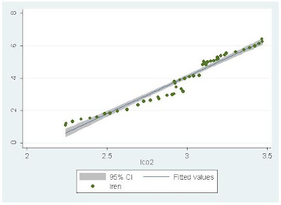
Along the best fit line, a 1% increase in CO2 emissions is associated with a 4.59% increase in renewable energy.
Here is how renewable energy correlates with GDP. Both variables are measured in natural logarithms.

Along the best fit line, a 1% increase in GDP is associated with a 2.99% increase in renewable energy. The high income elasticity is consistent with some of my previous research on renewable energy consumption in developed and emerging economies (here, here).
By comparison, a 1% increase in GDP is associated with a 0.58% increase in total energy consumption.

As the world economy rebounds from the Great Recession, economic activity will increase and GDP will increase. Increases in GDP have a bigger impact on renewable energy consumption than total energy consumption, so expect to see further increases in renewable energy in the future. Unfortunately, without a reasonable energy policy, Canada and the US will be left on the sidelines as other countries capture competitive advantage in the renewable energy sector.
Saturday, 26 January 2013
Canadian House Prices - January 2013
There is always lots of
interest in determining if housing prices in Canada are too high. There is even
some talk that the Canadian housing market is in a bubble (Macleans). The Economist has a
really nice interactive tool that allows users to compare housing markets in
different countries around the world. One way to compare housing prices across
time is to follow the ratio of house prices to income. According to the chart,
this value for Canada was 100 in 1985 and then rose quickly to 155 in 1989 (a 55% increase in just 4 years!).
After 1989, the ratio of house prices in Canada to income slowly dropped
throughout the 1990s. In 2001 the ratio of house prices to income in Canada started
to increase and now stands at a record high of 180. Notice that for any
particular year, the ratio of house prices to income in Canada is larger than
the corresponding value in Britain or the US. Of the countries shown in the chart,
the Canadian house price to income ratio is most similar to Australia (although
this ratio for Australia has been weakening in the past few years).

So what is the upshot for Canada? High ratios of house prices to income are not good for Canadians because many home buyers need to borrow money to buy a house. Borrowing money means taking on debt. Taking on debt today is easy because of the low interest rates, but once interest rates start to rise, mortgage payments for many are going to be a big problem. For foreign buyers with lots of money, rising interest rates are probably not much of a concern.
Wednesday, 23 January 2013
Predicting the Future
I am always interested in predicitions about the future.
"As we begin a new year, BBC Future has compiled 40 intriguing predictions made by scientists, politicians, journalists, bloggers and other assorted pundits in recent years about the shape of the world from 2013 to 2150." (BBC)

"As we begin a new year, BBC Future has compiled 40 intriguing predictions made by scientists, politicians, journalists, bloggers and other assorted pundits in recent years about the shape of the world from 2013 to 2150." (BBC)
Tuesday, 22 January 2013
US Airline Woes
More travelers are flying than ever before and yet airlines have a difficult time making money. The airline industry is a tough business to be in. Airplanes, fuel and people are the three biggest costs to airlines. New airplanes cost money and borrowed money is vulnerable to interest rate fluctuations. The price of jet fuel fluctuates with movements in the petroleum markets. Airlines require lots of people to make your flight as smooth as possible. The difficulties of running a profitable airline have pushed some US carriers into bankruptcy and created incentives to merge. US Airways has been through Chapter 11 bankruptcy proceedings twice and United and Delta each once. American recently filed for Chapter 11 and now it looks like a merger with US Airways is in the works. Mergers, however, often do not work out as planned with the anticipated managerial efficiencies and scale effects failing to materialize.
How efficient are US airlines? Using data published in a recent Economist article, I investigate the efficiency of US airlines.

To calculate technical efficiency I use data envelope analysis (DEA). DEA is a non-parametric approach to the estimation of production functions. I use four inputs (global capacity, domestic market share, employees, delayed/cancelled flights) and two outputs (market capitalization, operating profits). For those interested in the technical details, I use the 2 stage input approach with variable returns to scale (VRS).

The DEA results are presented in the above table. Total technical efficiency (CRS_TE) can be broken down into pure technical efficiency (VRS_TE) and a scale effect. The total technical efficiency measures indicate that US Airways, Delta, Southwest, and Alaska are efficient since their CRS_TE measures are equal to one. These companies are operating on the boundary of the production possibility frontier. The other companies are inefficient with American being the least efficient. American for example, can reduce its inputs by 99% and still produce the same output (measured by market capitalization and operating profits). This really shows the extent of American's problems. Pure technical efficiency (VRS_TE) is a measure of manager effectiveness. American's inefficiency is coming from a combination of managerial inefficiency (VRS_TE) and a scale effect inefficiency. American has the least effective management and the largest scale inefficiency. The unity value in the RTS column indicates that American is operating with increasing returns to scale. American needs to get bigger and become more efficient. I wonder if US Airways knows the extent of these inefficiencies and how difficult it is going to be to get the merger to work.
How efficient are US airlines? Using data published in a recent Economist article, I investigate the efficiency of US airlines.
To calculate technical efficiency I use data envelope analysis (DEA). DEA is a non-parametric approach to the estimation of production functions. I use four inputs (global capacity, domestic market share, employees, delayed/cancelled flights) and two outputs (market capitalization, operating profits). For those interested in the technical details, I use the 2 stage input approach with variable returns to scale (VRS).

The DEA results are presented in the above table. Total technical efficiency (CRS_TE) can be broken down into pure technical efficiency (VRS_TE) and a scale effect. The total technical efficiency measures indicate that US Airways, Delta, Southwest, and Alaska are efficient since their CRS_TE measures are equal to one. These companies are operating on the boundary of the production possibility frontier. The other companies are inefficient with American being the least efficient. American for example, can reduce its inputs by 99% and still produce the same output (measured by market capitalization and operating profits). This really shows the extent of American's problems. Pure technical efficiency (VRS_TE) is a measure of manager effectiveness. American's inefficiency is coming from a combination of managerial inefficiency (VRS_TE) and a scale effect inefficiency. American has the least effective management and the largest scale inefficiency. The unity value in the RTS column indicates that American is operating with increasing returns to scale. American needs to get bigger and become more efficient. I wonder if US Airways knows the extent of these inefficiencies and how difficult it is going to be to get the merger to work.
Monday, 14 January 2013
MBA Price and School Accreditation Have Little Impact on Demand
Here is an article from The Economist that is making the rounds. Rapidly rising tuition fees seem to have little impact on MBA applications.
"A school’s position in The Economist or the Financial Times ranking, however, has little impact on applications. Indeed, where an effect can be seen, it seems that rising in the rankings leads to fewer applicants. The researchers suspect that this may be because weaker students are put off from speculative applications. Another thing that apparently has no effect on applications is whether the school is accredited."
In the US, MBA degrees have grown faster than the population.Between 1971 and 2008, the number of new MBAs increased by a whopping 487.5% while the US population increased by 46.6%.


Can the trend continue?
"A school’s position in The Economist or the Financial Times ranking, however, has little impact on applications. Indeed, where an effect can be seen, it seems that rising in the rankings leads to fewer applicants. The researchers suspect that this may be because weaker students are put off from speculative applications. Another thing that apparently has no effect on applications is whether the school is accredited."
In the US, MBA degrees have grown faster than the population.Between 1971 and 2008, the number of new MBAs increased by a whopping 487.5% while the US population increased by 46.6%.
Can the trend continue?
Thursday, 10 January 2013
Forecasting, Benjamin Graham, and Female Hedge Fund Managers
I do not have time to go into these in great detail, but here is a collection of articles that I found very interesting.
Guru's Can't Actually Predict the Market ( Rick Ferri).
"It only took 2 years and about 200 predictions before the accuracy rating fell below 50 percent in early 2000. The cumulative accuracy has stayed below 50 percent ever since. By 2008, CXO had collected and graded more than 5,000 predictions and the rating stabilized at about 48 percent."

Examining Benjamin Graham's Record: Skill or Luck? (Greenbackd)

Returns at Hedge Funds Run by Women Beat the Industry (Dealbook).
"An index from the professional services firm Rothstein Kass showed that female hedge fund managers produced a return of 8.95 percent through the third quarter of 2012. By contrast, the HFRX Global Hedge Fund Index, released by Hedge Fund Research, logged a 2.69 percent net return through September."
"Female financiers can have particular advantages over their male counterparts, including being more risk-averse and better able to avoid volatility, the report says. The Rothstein Kass hedge fund index, based on 67 hedge funds with female owners or managers, may be a case in point."
Guru's Can't Actually Predict the Market ( Rick Ferri).
"It only took 2 years and about 200 predictions before the accuracy rating fell below 50 percent in early 2000. The cumulative accuracy has stayed below 50 percent ever since. By 2008, CXO had collected and graded more than 5,000 predictions and the rating stabilized at about 48 percent."
Examining Benjamin Graham's Record: Skill or Luck? (Greenbackd)
Returns at Hedge Funds Run by Women Beat the Industry (Dealbook).
"An index from the professional services firm Rothstein Kass showed that female hedge fund managers produced a return of 8.95 percent through the third quarter of 2012. By contrast, the HFRX Global Hedge Fund Index, released by Hedge Fund Research, logged a 2.69 percent net return through September."
"Female financiers can have particular advantages over their male counterparts, including being more risk-averse and better able to avoid volatility, the report says. The Rothstein Kass hedge fund index, based on 67 hedge funds with female owners or managers, may be a case in point."
Wednesday, 9 January 2013
Jobs and Unemployment in 2012
Since I have an undergraduate degree in physics and astronomy, I found this story about jobs with the highest and lowest unemployment rates in 2012 and the enclosed table particularly interesting.
Top 100 Hedge Funds
Bloomberg recently ran a story on the top 100 hedge funds of 2012. The data on assets and returns are for the 10 months ended on Oct. 31, 2012. The story is here and includes a downloadable pdf.


Subscribe to:
Posts (Atom)