Here is some very interesting reading comparing the investing styles behind Norway's pension funds and Yale's endowment funds (see here).
As ai-CIO reports:
"The Norway model – or its underlying philosophy – might be a more suitable template than Swensen’s Yale model for many investors, according to the paper published in October 2011 by David Chambers, Elroy Dimson and Antti Ilmanen. "There are three major reasons. First, while there is little long-term evidence of persistent alpha returns, there is ample historical support for beta returns from multiple factors. This can make the Norway Model attractive to many investors since they can also evaluate the potential future performance statistically, rather than relying on an ill-defined and unmeasured 'illiquid asset premium.' Second, the costs and managerial complexity of the Norway Model are significantly lower. Third, there is much less opportunity for agency problems when portfolio holdings are marked to market, centrally custodied, and observable. The Norway Model has been the subject of much recent discussion. It is likely to be an important contributor to investment thinking over the years to come.""
Both the Norway model and the Yale model can be reasonably replicated with low cost ETFs. So, what will it take for Canadian pension funds to jump on board?
Tuesday, 14 February 2012
Financial Market Must Reads
A V Shaped Economic Recovery?
Is it possible that we are experiencing a V shaped economic recovery? History will be the ultimate judge of how economic growth plays out following the worst economic downturn since the Great Recession but this chart does indicate some evidence of a V shaped recovery.
Friday, 10 February 2012
A CAPE For Canada
I have been thinking about what Shiller's Cyclically Adjusted P/E (CAPE) ratio would look like for Canada for sometime. Basically, CAPE takes the price of an index and divides by a 10 year moving average of earnings. CAPE charts for the US are easily accessible, but so far, CAPE ratios for other countries are not that numerous. On his blog, Mabane Faber has posted CAPE ratios for a number of different countries including Canada.
Here is what the CAPE ratio looks like for Canada.

Here is what the TSX looks like over the same time period.

Notice that the CAPE has been trending downwards across time making it difficult to get clear over/under valuation signals. While CAPE may be useful for the US and other countries, I am not sure how useful it is for Canada.
Saturday, 4 February 2012
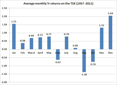
Seasonality and Trend Following on The TSX
Here is a chart showing how three simple investment strategies on the TSX compare. The returns are calculated from price returns (no dividends) over the period 1957 to 2011. The MA(10) switch portfolio uses a moving average trend following strategy by comparing monthly closing prices with a moving average of length ten. Buy or hold the TSX when the monthly close of the TSX is above the 10 month moving average and sell the TSX if it falls below the 10 month moving average. The seasonal switch portfolio invests in the TSX during the 6 month period November to April and then at the end of April the portfolio is sold and the money held in 3 month Treasury bills. The buy and hold strategy produces the lowest returns and highest standard deviation.The seasonal switch produces the highest returns and lowest standard deviation.
Using these average annual returns it is useful to do some future value calculations. Suppose that at the beginning of each year, an individual invested $13,500. This is done each year for 25 years. At the end of a 25 year period, the buy and hold strategy generates $733,914 while the seasonal switch portfolio generates $1,385,554. Commissions and trading fees are not included in the calculations.

Notice that average monthly returns on the TSX do vary considerably.

Wednesday, 1 February 2012
E7 vs G7
In an interesting article in the Globe and Mail, Ranga Chand makes a good argument for how the Group of 7 (G7) countries of Canada, France, Germany, Italy, Japan, the U.K.and the U.S. are being out paced in economic growth by the Emerging 7 (E7) countries of China, India, Indonesia, Brazil, Russia, Turkey and Mexico. As he points out, these countries now account for close to 31 per cent of world GDP, up from 19 per cent twenty years ago. During this same time period, the G7 has seen its share of world output fall from 51 per cent to 38 per cent.Over the past 4 years, the growth rates in the E7 countries are astonishing. Except for Canada, the G7 countries have not recorded much economic growth over this period.

Rising CO2 emissions from China and India are a concern. Hopefully the Environmental Kuznets Curve (EKC) hypothesis applies to the E7. The EKC postulates a long-run curvilinear relationship between carbon dioxide emissions and income. At first, emission rise with increases in income, but after some inflection point emissions begin to decline.
While the E7 countries have recorded very impressive recent economic growth, their ability to use monetary and fiscal policy to help steer future economic growth varies considerably. According to recent research done by The Economist, some of the E7 are in a good position to use monetary and fiscal policy to help shape their economy. The Economist has devised a "wiggle room index" which ranks emerging economies on how much monetary and fiscal flexibility they have. India, Turkey and Brazil are in the red zone (not much wiggle room), Mexico is in the middle of the pack while China, Indonesia and Russia each have plenty of wiggle room.
Rising CO2 emissions from China and India are a concern. Hopefully the Environmental Kuznets Curve (EKC) hypothesis applies to the E7. The EKC postulates a long-run curvilinear relationship between carbon dioxide emissions and income. At first, emission rise with increases in income, but after some inflection point emissions begin to decline.
Subscribe to:
Posts (Atom)