For those working in quantitative finance, this has been expected for a while. Now, there is some good solid research backing up this claim. The full paper is available here.
"Several
hundred individuals who hold a Ph.D. in economics, finance, or others
fields work for institutional money management companies. The gross
performance of domestic equity investment products managed by
individuals with a Ph.D. (Ph.D. products) is superior to the performance
of non-Ph.D. products matched by objective, size, and past performance
for one-year returns, Sharpe Ratios, alphas, information ratios, and the
manipulation-proof measure MPPM. Fees for Ph.D. products are lower than
those for non-Ph.D. products. Investment flows to Ph.D. products
substantially exceed the flows to the matched non-Ph.D. products.
Ph.D.s’ publications in leading economics and finance journals further
enhance the performance gap."
Showing posts with label stocks. Show all posts
Showing posts with label stocks. Show all posts
Sunday, 17 November 2013
Saturday, 3 August 2013
Stock Market Capitalization to GDP
Stock market capitalization to GDP has been called by some as the best measure of a stock market's valuation (see here)and (here). The market capitalization to GDP ratio is calculated by dividing stock market capitalization by GDP and multiplying the result by 100. This measure can be thought of as an economy wide price to sales ratio. Higher values indicate higher valuations. In general, values over 100 are indicative of over valuations. Lower values indicate lower valuations, but there is considerable disagreement as to what values represent undervaluation in today's environment.
Here is how this ratio compares across time for the United States. While many charts use S&P 500 market cap in the calculation, I have used a more broader measure (non financial corporate business: corporate equity, liabilities) obtained from the Federal Reserve. Notice how the ratio tends to peak before recessions. It wasn't until 1999 that market capitalization to GDP broke above 100% but since that time, it has averaged at a higher value than in the pre 1999 time period. Over the last 10 years, undervaluation seems to occur somewhere in the 60% to 80% range. In any case, the current value is high in an historical context, suggesting that at least from the perspective of this measure, the US stock market is approaching overvalued territory.

Here is a heat map showing stock market capitalization to GDP for a variety of countries. The data are from the World Bank online data base. The most recent measures show that Canada, the United States, England, Sweden, Switzerland, Chile, Malaysia, Thailand, and South Africa are all overvalued. Rewind the slider scroll bar back to 1988 and push play to see how this ratio changes across time.
Market capitalization of listed companies (% of GDP)
Here is how this ratio compares across time for the United States. While many charts use S&P 500 market cap in the calculation, I have used a more broader measure (non financial corporate business: corporate equity, liabilities) obtained from the Federal Reserve. Notice how the ratio tends to peak before recessions. It wasn't until 1999 that market capitalization to GDP broke above 100% but since that time, it has averaged at a higher value than in the pre 1999 time period. Over the last 10 years, undervaluation seems to occur somewhere in the 60% to 80% range. In any case, the current value is high in an historical context, suggesting that at least from the perspective of this measure, the US stock market is approaching overvalued territory.
Here is a heat map showing stock market capitalization to GDP for a variety of countries. The data are from the World Bank online data base. The most recent measures show that Canada, the United States, England, Sweden, Switzerland, Chile, Malaysia, Thailand, and South Africa are all overvalued. Rewind the slider scroll bar back to 1988 and push play to see how this ratio changes across time.
Market capitalization of listed companies (% of GDP)
Saturday, 29 June 2013
Canadian REITs and Interest Rates
The past 2 months have been very difficult for Canadian investors. First interest rate worries spooked the banks and REITs, then weak commodity markets torpedoed the resources sector. Gold, the precious metal that is the go-to investment in times of inflation and worry is now trading at a 2 year low. Most recently, Canadian telecoms got whacked on news that Verizon was thinking of moving into Canada.
Real estate investment trusts (REITs) have been good investments for a long time. REITs pay bond size dividends and offer the opportunity for equity like price appreciation. REITs have been so good for so long, that many investors have a sizable portion of their investment portfolio in REITs.
To find out more about what has been happening with REITs, I decided to analyze how sensitive one of Canada's biggest REIT ETFs, the iShares capped REIT index (XRE) is to movements in interest rates.
Here is how XRE has performed since 2008.

The last recession was hard on XRE, but recovery came quickly.
Here is how Canadian 3 month T-bills and 10 year government bonds have performed. It seems reasonable to expect that REITs are negatively correlated with T-bill or bond yields, since increases in fixed income yields offer competitive less risky alternatives to investing in REITs. These falling yields have helped push the price of XRE higher.

I collected monthly data on XRE, 90 day T-bill yields, and the yield on 10 year government of Canada bonds. I calculate the one month return on XRE and denote it as xre_r. I regress one month XRE returns on the yields from T-bills and bonds.
A regression of xre_r on the 90 day T-bill yield produces the following results.
xre_r = 1.613 -0.365 tbill
The estimated coefficient is negative indicating that a 1% increase the tbill yield reduces monthly returns by 0.365%. The sign of this coefficient is as expected, negative, but the estimated coefficient is not statistically significant at conventional levels. The R squared for this regression is 0.0115. Not much going on here.
A regression of xre_r on the 10 year bond yield produces the following results.
xre_r = 1.239 -0.105 bond
As expected the estimated coefficient on the 10 year bond variable is negative. This estimated coefficient is not, however, statistically significant at conventional levels of significance.The R squared from this regression is 0.0005. This is even lower than in the T-bill regression.
On the face of it, there does not seem to be too much sensitivity of REITs to movements in interest rates. Another possibility is that the relationship between XRE and interest rates is time varying. The regression results reported above assume that the coefficient on the interest rate variable is constant over the sample period. This may not be the case, in which case, a time varying beta approach may be more informative. To investigate this I used a rolling window analysis to estimate the coefficient on the T-bill variable using a rolling window regression approach with a fixed window length of 60 observations.

Whoa! Now here is something interesting. Up until the beginning of 2012, the sensitivity of XRE to the T-bill yield was fairly constant. Starting in early 2012, however, the relationship changed with REITs becoming more sensitive to interest rates. The most recent value of the estimated coefficient on the T-bill variable is -5.41. This means that a 1% increase in the T-bill yield decreases monthly returns on XRE by 5.41%. For most of the sample period, REIT investors were not too sensitive to movements in the 90 day T-bill rates. That has clearly changed over the past year. REIT investors have become much more concerned with rising interest rates. With falling REIT prices, the yields on REITs will eventually start to look good on a risk adjusted basis. Given the large sell off in REITs, however, this could take some time.
Wednesday, 17 April 2013
Maximum Drawdown for Previous Post
In my previous post I compared several investment strategies for the TSE. Here is an updated table which includes drawdown along with some of the usual risk measures. The seasonal strategy has the highest average annual return (11.35%) and lowest standard deviation. The seasonal strategy has the highest Sharpe Ratio, Sortino Ratio, and Omega Ratio.The seasonal strategy also has the lowest maximum drawdown.

Here is a chart showing how $1000 invested in December of 1970 has performed for each of the strategies.

Overall, the seasonal and moving average strategies provide some downside protection in case things go really bad.

Here is a chart showing how $1000 invested in December of 1970 has performed for each of the strategies.

Overall, the seasonal and moving average strategies provide some downside protection in case things go really bad.
Wednesday, 10 April 2013
Testing Absolute Momentum on the TSE
A new research paper by Gary Antonacci on absolute momentum piqued my interest.In its simplest form, absolute momentum strategies compare excess asset returns over a pre-defined look back period. If excess returns over the look back period are positive, invest in the asset. If excess returns over the look back period are negative, invest in a 3 month t bill.Antonacci's research shows that absolute momentum strategies work well in a number of markets including US equities, US REITS, US bonds, EAFE, and gold. I thought it would be interesting to see how well an absolute momentum strategy works for the TSE.
For equity data I use the MSCI Canada total return monthly data (includes dividends). For the risk free rate, I use 3 month Canadian t bills. I choose a look back period of 12 months. 12 months seems to work well for other assets so I choose 12 months for my analysis. This minimizes data snooping. The estimation sample covers the period January 1971 to March 2013. For comparison purposes, I also include buy and hold (B&H), a simple MA(10) switching portfolio, and a seasonal switch strategy (invest in the TSE in the 6 months November through April: invest in 3 month t bills for the 6 months May through October). The calculations do not include trading costs.

In the case of Canada, there is some evidence that absolute momentum works. Absolute momentum is preferred to buy and hold because it has a higher Sharpe ratio, Sortino ratio, and Omega ratio. One undesirable feature, however, is that absolute momentum has higher downside risk than buy and hold. Notice how the seasonal switch strategy really stands out. The seasonal switch strategy has the highest Sharpe ratio, Sortino ratio, and Omega ratio. The seasonal switch strategy also has the lowest standard deviatiion and downside risk.
Friday, 22 March 2013
Risk Measures for TSX Investing Strategies
Here are some risk measures for my previous post. Notice that the seasonal switch strategy generates the highest average annual returns, lowest average annual standard deviation, highest Sharpe ratio, and lowest downside risk. I calculate downside risk using semi-standard deviations with a benchmark of 0.


Wednesday, 20 March 2013
Seasonality and Trend Following on The TSX
Here is a chart showing how three simple investment strategies on the
TSX compare. The returns are calculated from price returns (no
dividends) over the period 1957 to 2012. The MA(10) switch portfolio
uses a moving average trend following strategy by comparing monthly
closing prices with a moving average of length ten. Buy or hold the TSX
when the monthly close of the TSX is above the 10 month moving average
and sell the TSX if it falls below the 10 month moving average. The
seasonal switch portfolio invests in the TSX during the 6 month period
November to April and then at the end of April the portfolio is sold and
the money held in 3 month Treasury bills. The buy and hold strategy
produces the lowest returns and highest standard deviation.The seasonal
switch produces the highest returns and lowest standard deviation.
Using these average annual returns it is useful to do some future value calculations. Suppose that at the beginning of each year, an individual invested $13,500. This is done each year for 25 years. At the end of a 25 year period, the buy and hold strategy generates $730,747 while the seasonal switch portfolio generates $1,337,942. Commissions and trading fees are not included in the calculations.

The average monthly returns on the TSX vary considerably. September and October are, on average the worst months while December and January are the best months.

Thursday, 10 January 2013
Forecasting, Benjamin Graham, and Female Hedge Fund Managers
I do not have time to go into these in great detail, but here is a collection of articles that I found very interesting.
Guru's Can't Actually Predict the Market ( Rick Ferri).
"It only took 2 years and about 200 predictions before the accuracy rating fell below 50 percent in early 2000. The cumulative accuracy has stayed below 50 percent ever since. By 2008, CXO had collected and graded more than 5,000 predictions and the rating stabilized at about 48 percent."

Examining Benjamin Graham's Record: Skill or Luck? (Greenbackd)

Returns at Hedge Funds Run by Women Beat the Industry (Dealbook).
"An index from the professional services firm Rothstein Kass showed that female hedge fund managers produced a return of 8.95 percent through the third quarter of 2012. By contrast, the HFRX Global Hedge Fund Index, released by Hedge Fund Research, logged a 2.69 percent net return through September."
"Female financiers can have particular advantages over their male counterparts, including being more risk-averse and better able to avoid volatility, the report says. The Rothstein Kass hedge fund index, based on 67 hedge funds with female owners or managers, may be a case in point."
Thursday, 20 December 2012
Canadian Equities and Emerging Stock Markets
To international investors, investing in Canadian equities amounts to investing in banks and natural resource companies. Currently, the largest sectors on the TSX (in terms of market capitalization) are financial services (32%), energy (25%) and raw materials (18%). These three sectors account for a whopping 75% of the TSX. The performance of the TSX depends, to a large extent, on the demand for natural resources.
Here is a chart comparing Canadian equities with equity markets in Europe and the Far East (EAFE), emerging markets (EM) and the United States (USA). The data are in US dollars, include dividends and cover the period January 2002 to November 2012. Notice that each equity index tends to peak and trough around the same times but in terms of performance, emerging markets and Canada are the two big leaders.

In order to determine how well movements in Canadian stock prices can be explained by movements in other major equity markets, I fit an autoregressive distributed lag (ARDL) model. Here are the regression results.

The model fits well. Residual diagnostics (not shown) indicate serial correlation in the residuals or squared residuals is not a problem. The plot of actual values vs fitted values shows how tight the fit is. The variables are transformed to natural logarithms which helps to reduce the variability in the data. The natural logarithm transformation also means that the coefficient estimates can be interpreted as elasticities. The largest contemporaneous effect comes from emerging markets (estimated coefficient of 0.54 with a p value of < 0.01). The estimated coefficient on US equity markets is positive and statistically significant at 5% but 47% smaller than the estimated coefficient on emerging markets.

Emerging markets (EM) has the largest short-run elasticity. In the short-run, a 1% increase in EM stock prices increases Canada stock prices by 0.54%. Emerging markets also has the largest long-run elasticity. In the long-run, a 1% increase in emerging market stock prices increases Canadian stock prices by 0.76%. Long-run EAFE and USA elasticities are much smaller than the long-run EM elasticity.
 The empirical model fits well and provides support for the hypothesis that Canadian stock prices are more influenced by movements in emerging market stock prices than movements in US stock prices or movements in other developed markets.
Here is a chart comparing Canadian equities with equity markets in Europe and the Far East (EAFE), emerging markets (EM) and the United States (USA). The data are in US dollars, include dividends and cover the period January 2002 to November 2012. Notice that each equity index tends to peak and trough around the same times but in terms of performance, emerging markets and Canada are the two big leaders.

In order to determine how well movements in Canadian stock prices can be explained by movements in other major equity markets, I fit an autoregressive distributed lag (ARDL) model. Here are the regression results.

The model fits well. Residual diagnostics (not shown) indicate serial correlation in the residuals or squared residuals is not a problem. The plot of actual values vs fitted values shows how tight the fit is. The variables are transformed to natural logarithms which helps to reduce the variability in the data. The natural logarithm transformation also means that the coefficient estimates can be interpreted as elasticities. The largest contemporaneous effect comes from emerging markets (estimated coefficient of 0.54 with a p value of < 0.01). The estimated coefficient on US equity markets is positive and statistically significant at 5% but 47% smaller than the estimated coefficient on emerging markets.

Emerging markets (EM) has the largest short-run elasticity. In the short-run, a 1% increase in EM stock prices increases Canada stock prices by 0.54%. Emerging markets also has the largest long-run elasticity. In the long-run, a 1% increase in emerging market stock prices increases Canadian stock prices by 0.76%. Long-run EAFE and USA elasticities are much smaller than the long-run EM elasticity.

Sunday, 18 November 2012
How Efficient is Reseach in Motion?
Watching Research in Motion's (RIMM) stock price fall over the past few years has been difficult. While RIMM gets singled out for its poor stock price performance and Apple becomes the most valuable company in the world by stock market capitalization, it is important to point out that some of RIMM's competitors have not been doing so well. Over the past year, Apple has been the clear winner, but Ericson, Nokia and Research in Motion have each underperformed.

One thing to remember about companies based on cutting edge technologies is that no company can be the leader forever. The product landscape changes. What is new today becomes common place in the future. Think about the cutting edge technology companies of 15 years ago (Microsoft, Cisco, Dell). These companies are still in business but now they are no longer considered young dynamic upstarts but rather established mature companies. In my view, handset makers are entering a more mature phase in which the explosive growth in hand sets is going to slow considerably. A new United Nations report reveals that there are now 6 billion cellphone users in the world. That means that 86 out of every 100 people now have a cellphone.
A different way to compare RIMM with its competitors is to calculate how efficient it is. To calculate technical efficiency I use data envelope analysis (DEA). DEA is a non-parametric approach to the estimation of production functions. I use three inputs (employees, total assets, total operating costs) and one output (total revenues). Data are for the year 2011. Samsung is omitted from the comparison because it is a huge multi-product conglomerate. For those interested in the technical details, I use the 2 stage input approach with variable returns to scale (VRS).

The DEA results are presented in the above table. Total technical efficiency (CRS_TE) can be broken down into
pure technical efficiency (VRS_TE) and a
scale effect. The total technical efficiency measures indicate that Apple,
Google and Research in Motion are efficient since their CRS_TE measures are
equal to one. Ericsson, Motorola are Nokia are inefficient. Nokia. for example, can reduce
its inputs by 29% and still produce the same output. In the case of Motorola,
the pure technical efficiency measure of 1 indicates that management is efficient and
the inefficiencies are coming from the scale effect which measures the size of
the company.
So, while Research in Motion's stock price has suffered over the past year, it is, at least by these calculations, an efficient company.
Sunday, 10 June 2012
Sustainable Investing vs Wine and Gold
What do sustainable investments, wine and gold have in common over the past ten years? Well, for one thing, investments in wine and gold have vastly outperformed an investment in sustainable companies.Below is a chart showing the performance of wine (measured by the Live Ex Fine Wine 100 Index), sustainable equities (as measured by the Dow Jones Sustainability Index), gold (the front month futures contract on COMEX gold), and the S&P500.
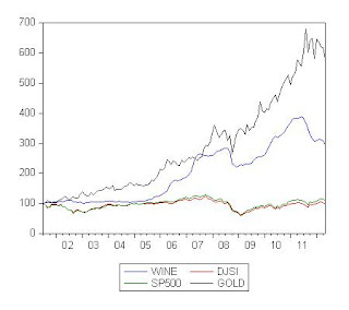
Sharpe ratios show that wine has been the best investment followed closely by gold. The S&P 500 has a slightly larger Sharpe ratio then the Dow Jones Sustainability Index, but both Sharpe ratios are negative over the sample period.
To combine the concepts of sustainability and wine together, how about a sustainability wine index? An example of this would be an index that follows organic wines.

Sharpe ratios show that wine has been the best investment followed closely by gold. The S&P 500 has a slightly larger Sharpe ratio then the Dow Jones Sustainability Index, but both Sharpe ratios are negative over the sample period.
| wine | djsi | sp500 | gold | ||
| 0.79 | -0.12 | -0.06 | 0.78 |
Friday, 8 June 2012
CAPE Values for April 2012
I am a follower of Robert Shiller's cyclically adjusted p/e ratio (CAPE). The CAPE seems to work reasonably well for the US and I am always interested in what CAPEs look like for other countries. To date, however, Mebane Faber is the only person that I am aware of that does this type of calculation for other countries.I have taken the data from his recent post and ranked the countries according to CAPE. Italy, Spain, Netherlands and Belgium all have CAPE values below 10. Notice these are all European countries. Canada and the US have high CAPE values.
| Country | Value |
| Italy | 7.34 |
| Spain | 8.33 |
| Netherlands | 9.4 |
| Belgium | 9.62 |
| Russia | 10.24 |
| France | 10.98 |
| Austria | 11.06 |
| China | 12.88 |
| UK | 13.24 |
| Singapore | 13.27 |
| Germany | 13.7 |
| Australia | 14.01 |
| Turkey | 14.65 |
| Switzerland | 14.67 |
| Japan | 15.2 |
| Sweden | 15.21 |
| Brazil | 15.77 |
| Taiwan | 16 |
| Hong Kong | 16.05 |
| Thailand | 16.34 |
| South Africa | 17.44 |
| Korea | 18.62 |
| Canada | 18.86 |
| India | 20.06 |
| Mexico | 21.69 |
| USA | 21.76 |
| Malaysia | 23.12 |
| Chile | 26.4 |
| Indonesia | 29.41 |
| source: http://www.mebanefaber.com/2012/05/24/global-shiller-capes/ |
Monday, 7 May 2012
Stock trading still well below highs
Stock trading, as measured by the turnover ratio, is still well below record highs. The turnover ratio is the total value of shares traded during the period
divided by the average market capitalization for the period. The steep drops in the turnover ratio are particularly evident for the United States (US) and the United Kingdom (UK). In 2010, the UKs turnover ratio stood at 101.9% a value not seen since 2003. The turnover ratio is still trending down.
A lower turnover ratio may be better for buy and hold investors since a lower turnover may reduce volatility. A lower turnover ratio is also a sign of less interest in stock markets. There is some evidence, from the US and the UK, that seasoned older investors, after have being burned by the 2000s, are moving money out of equities and into fixed income. This demographic shift is of concern because as the baby boomers consolidate their wealth in less risky assets, lower turnover ratios may remain below their peak values for many years. Moreover, many younger investors are also wary of investing in equities and prefer to invest in bonds, even as bond yields sit at record lows. If these two trends continue, it may take a long time before we see a big increase in stock trading.
A lower turnover ratio may be better for buy and hold investors since a lower turnover may reduce volatility. A lower turnover ratio is also a sign of less interest in stock markets. There is some evidence, from the US and the UK, that seasoned older investors, after have being burned by the 2000s, are moving money out of equities and into fixed income. This demographic shift is of concern because as the baby boomers consolidate their wealth in less risky assets, lower turnover ratios may remain below their peak values for many years. Moreover, many younger investors are also wary of investing in equities and prefer to invest in bonds, even as bond yields sit at record lows. If these two trends continue, it may take a long time before we see a big increase in stock trading.
Friday, 4 May 2012
Trend following for Canadian REITs
It has been a difficult week for Canadian equities adding to an already sluggish year to date for most equity sectors. The Canadian real estate investment trusts (REITs) sector is the only Canadian equity sector that has been doing well. This sector can be invested in through the XRE ETF. Here is a chart showing how a buy and hold (b&h) strategy of investing in the XRE compares with an investment strategy based on a 10 month moving average. The MA(10) switch portfolio
uses a moving average trend following strategy by comparing monthly
closing prices with a moving average of length ten. Buy or hold the XRE when the monthly close of the XRE is above the 10 month moving average
and sell the XRE and invest in 3 month T bills if the monthly close falls below the 10 month moving average. The chart shows monthly data from July 2003 to March 2012. The moving average trend following strategy outperforms buy and hold.

The risk measures indicate that the moving average trend following strategy outperforms buy and hold. The average annual return for b&h is 11.20% while the average annual return for the trend following strategy is 14.19%. The trend following strategy has a lower standard deviation, higher Sharpe ratio and lower downside risk. Downside risk is calculated relative to a benchmark of 0.
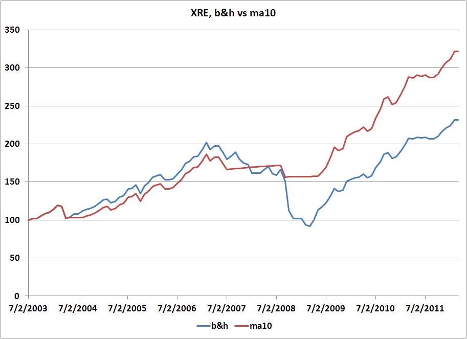
The risk measures indicate that the moving average trend following strategy outperforms buy and hold. The average annual return for b&h is 11.20% while the average annual return for the trend following strategy is 14.19%. The trend following strategy has a lower standard deviation, higher Sharpe ratio and lower downside risk. Downside risk is calculated relative to a benchmark of 0.
| b&h | ma10 | |
| mean | 11.20 | 14.19 |
| stdev | 16.69 | 11.22 |
| sharpe | 0.19 | 0.37 |
| downside | 12.51 | 7.13 |
Monday, 30 April 2012
Risk measures for the previous XIU post
Here are some risk measures for the XIU trading strategies presented in my last post. I considered three investing strategies: buy and hold, a MA(10) trend following strategy, a seasonal switch.The MA(10) trend following strategy produces the highest average annual return (6.85%) and the second largest standard deviation. Based on Sharpe ratios, the MA(10) trend following strategy is preferred. The seasonal strategy has the lowest downside risk while buy and hold has the highest downside risk. Downside risk is measured by semistandard deviations with a benchmark of 0.
| |||||||||||||||||||||||
Sunday, 29 April 2012
Sell in May? The Case of XIU
As April comes to a close, it is time once again to think about seasonal portfolio strategies. In one of my previous posts, I showed how a seasonal portfolio strategy applied to the TSX provides higher returns and lower risk than a buy and hold strategy.Here is a chart showing how three simple investment strategies for the XIU ETF compare. The XIU is the most widely traded ETF in Canada and forms the basis of many investment portfolios. The returns are calculated from total returns (price returns plus dividends) over the period July 2000 to March of 2012. The MA(10) switch portfolio
uses a moving average trend following strategy by comparing monthly
closing prices with a moving average of length ten. Buy or hold the XIU
when the monthly close of the TSX is above the 10 month moving average
and sell the XIU and invest in 3 month T bills if the monthly close falls below the 10 month moving average. The
seasonal switch portfolio invests in the XIU during the 6 month period
November to April and then at the end of April the portfolio is sold and
the money held in 3 month Treasury bills. The chart shows how a $100 investment made in July of 2000 has performed.The MA(10) switching strategy outperforms the seasonal switch portfolio which in turn outperforms buy and hold.


Tuesday, 6 March 2012
Canadian Equities and Emerging Markets
It is hard to grow an economy without sufficient natural resources.Countries that have their own natural resources can exploit them, those that do not have sufficient natural resources need to buy them. Here in Canada, we are often told how important Canada's natural resources are to other economies.
As an example of how resource use patterns vary by country income class consider energy use. The chart below shows energy use (kt of oil equivalent) for high income countries (HIC), low & middle income countries (LMY) and upper middle income countries (UMC). Notice how energy use in developing countries has been growing steadily since the mid 2000s.

At the end of February the TSX composite index (represented by the ETF with ticker symbol (XIC)) broke above its 10 month moving average indicating (hopefully) a new period of upward momentum.

The US equity markets have had a good run so far this year while the TSX has lagged behind. It is true that Canada does most of its trade with the US but from an investment in equities perspective, Canada's fortunes are increasingly tied more to emerging economies. Here are some regression results from a model relating Canadian stock prices to the stock prices of EAFE, EM and USA. All of the stock price indexes are in US dollars. The regression is estimated in logs so that the estimated coefficients can be interpreted as elasticities. The regression is consistent with a cointegrating relationship (residuals are stationary) and is best thought of as representing a long-run relationship between the variables. Notice that the coefficient on the emerging markets variable (EM) is positive and statistically significant. A 1% increase in EM increases the Canadian equity market by 0.81%. In this model, the other equity markets (EAFE and US) do not have a statistically significant impact on Canadian equities.

Tuesday, 14 February 2012
Norway's Pension Fund vs Yale's Endowment Fund
Here is some very interesting reading comparing the investing styles behind Norway's pension funds and Yale's endowment funds (see here).
As ai-CIO reports:
"The Norway model – or its underlying philosophy – might be a more suitable template than Swensen’s Yale model for many investors, according to the paper published in October 2011 by David Chambers, Elroy Dimson and Antti Ilmanen. "There are three major reasons. First, while there is little long-term evidence of persistent alpha returns, there is ample historical support for beta returns from multiple factors. This can make the Norway Model attractive to many investors since they can also evaluate the potential future performance statistically, rather than relying on an ill-defined and unmeasured 'illiquid asset premium.' Second, the costs and managerial complexity of the Norway Model are significantly lower. Third, there is much less opportunity for agency problems when portfolio holdings are marked to market, centrally custodied, and observable. The Norway Model has been the subject of much recent discussion. It is likely to be an important contributor to investment thinking over the years to come.""
Both the Norway model and the Yale model can be reasonably replicated with low cost ETFs. So, what will it take for Canadian pension funds to jump on board?
Financial Market Must Reads
Friday, 10 February 2012
A CAPE For Canada
I have been thinking about what Shiller's Cyclically Adjusted P/E (CAPE) ratio would look like for Canada for sometime. Basically, CAPE takes the price of an index and divides by a 10 year moving average of earnings. CAPE charts for the US are easily accessible, but so far, CAPE ratios for other countries are not that numerous. On his blog, Mabane Faber has posted CAPE ratios for a number of different countries including Canada.
Here is what the CAPE ratio looks like for Canada.

Here is what the TSX looks like over the same time period.

Notice that the CAPE has been trending downwards across time making it difficult to get clear over/under valuation signals. While CAPE may be useful for the US and other countries, I am not sure how useful it is for Canada.
Subscribe to:
Posts (Atom)